Creating a scheduling system for a complex feature management tool that includes the ability to plan for changes to a flag and also the rules within a flag. This feature also includes the ability to view upcoming scheduled changes and scheduled changes that have already occured.
Key Concepts
Before we dive into this project, I should define a few terms and concepts.
- Flag: A flag is basically a wrapper for a block of code. By wrapping the block in a flag it allows a non-technical user to toggle the code on and off using Optimizely’s Feature Experimentation tool. A Flag can be used for wrapping any kind of content or code including:
- A hero banner
- A website footer
- An entire page
- A single line of text
- Rule: Within a flag are one or more rules. A rule is basically a way of serving a specific experience to a specific audience. Those experiences can be simple personalization campaigns or A/B tests to test out new content or features. A few quick examples:
- Rule 1: Show Image A to US users
- Rule 2: Test button copy “Click Here” against button copy “Get Started” for mobile users
- Rule 3: Show banner “Welcome back” to returning users
Optimizely’s Feature Experimentation tool allows non-technical users to set up multiple flags and multiple rules within flags to allow them to quickly change and test different aspects of the customer experience.
Problem
Optimizely’s Feature Experimentation tool is a very powerful way to customize and personalize content for users. But a major issue has been that all changes that you made to a Flag or a Rule can only take immediate effect. Our users have suggested that it would be helpful to be able to schedule changes to take place in the future. A few use cases include:
- Scheduling a holiday promotional banner to start and end on specific holiday sale dates.
- Gradually increasing the traffic exposed to a new feature by 10% per day to limit damage in the event of something going wrong with the new feature.
- Showing a new feature to a specific “beta testers” audience for 1 month, then changing the audience to “everyone.”
- Automating any changes that might need to occur outside of normal working hours.
Design Explorations
Because the problem was well-documented from our Customer Success team, we decided to start doing some early design explorations of what this complex feature could look like. Here are a few early iterations:
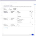
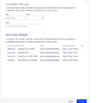
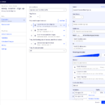
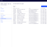
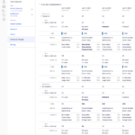
We tried a few fairly divergent ideas so that we had a wide variety of approaches to share with customers to get feedback.
From internal feedback we narrowed it down to two design directions to bring to customers:
- Use existing interface to make scheduled changes.
Instead of clicking “Save” on a Flag you would instead have the option of clicking “Save” or “Schedule for later.” - Create a new interface for scheduled changes.
All scheduled changes would be done in a newly designed “Scheduled Changes” area separate from the existing Flag interface.
User Research
I created prototypes in Figma for each of the two design directions. This allowed users to click through each to really get a sense of how they work.
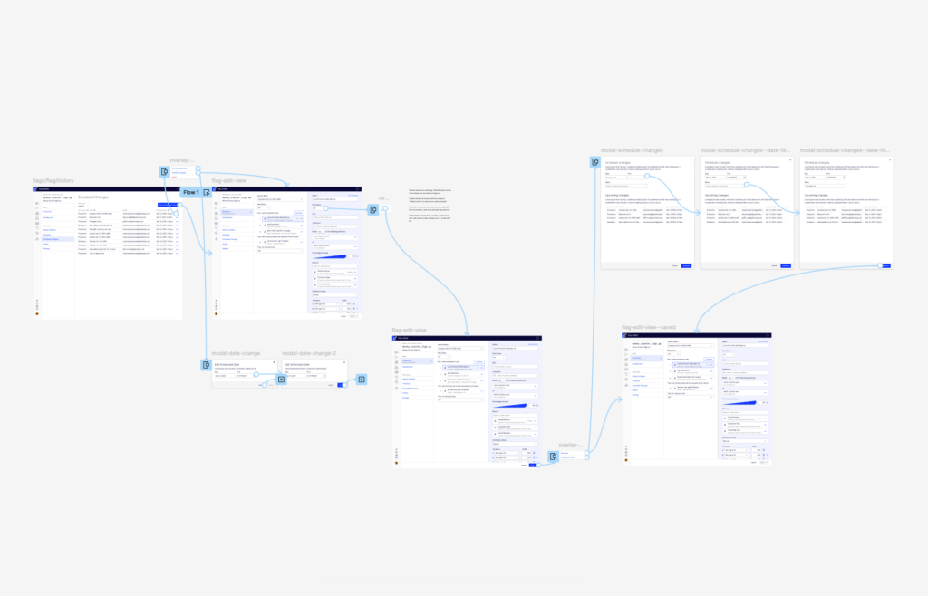
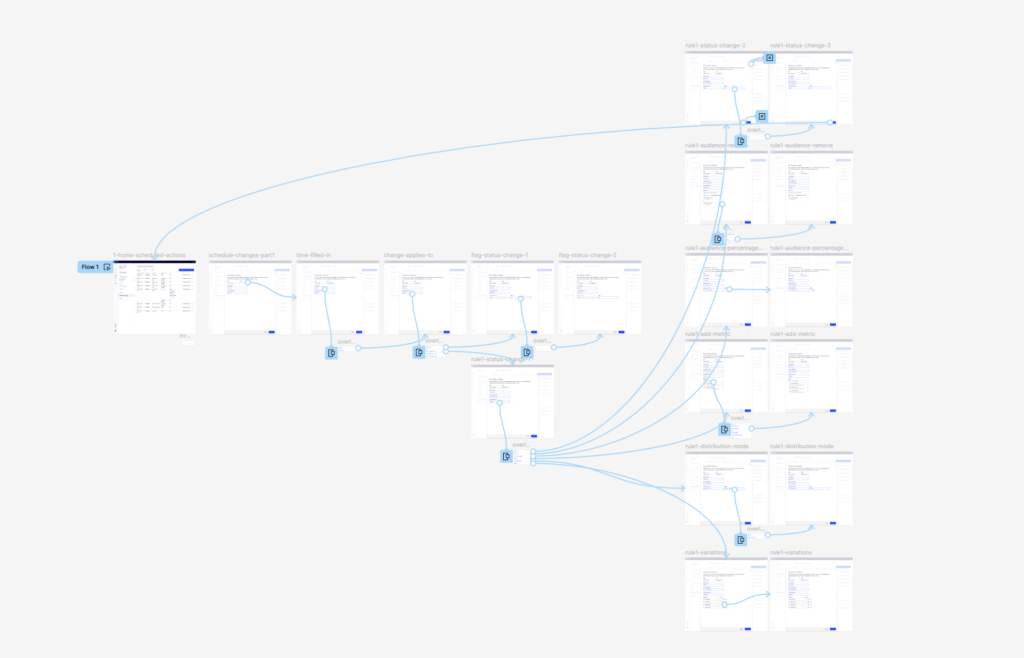
While testing the prototypes our customers identified several small issues for us to resolve. In addition, while they liked both prototypes, there was a general preference for option 2. With that in mind we set to work refining prototype 2 into a dev-ready design.
Development Prep
Because of the complexity of this project, it was especially important that I create a full spec sheet for the developers to make sure they had answers to all the potential questions that would come up while coding. Here’s a sample screen showing the dev notes I’ve added.
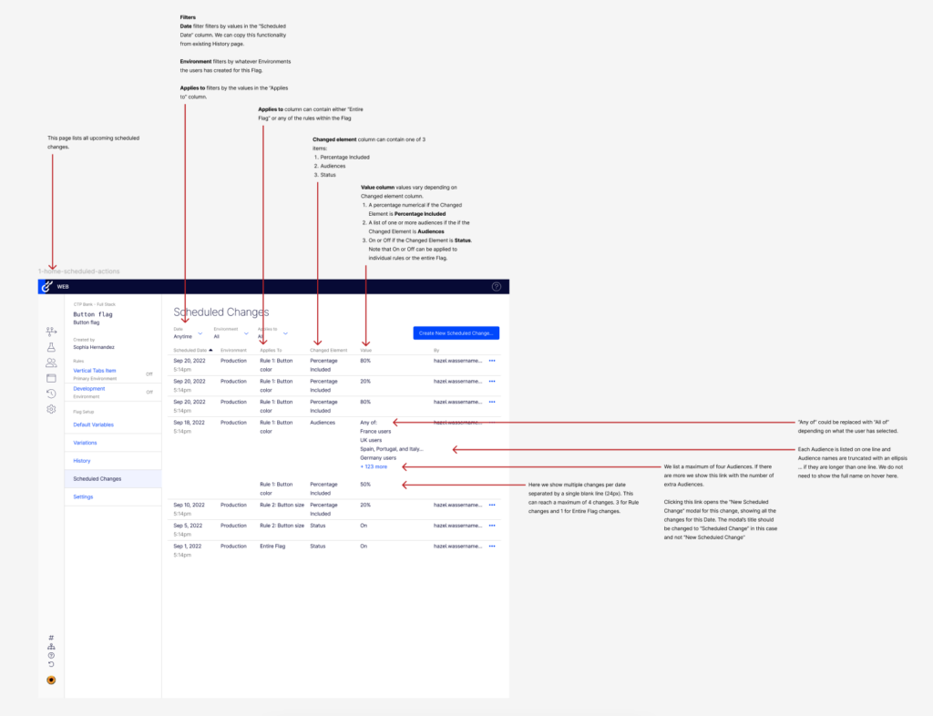
This part of the process is helpful for devs, but it’s also helpful for me, as the designer, to think through all the edge cases and find any remaining issues that need to be addressed. It’s good to address questions like:
- What happens when there are a lot of items in this list?
- What if the content overflows the container? How does scrolling or pagination work?
- What if there is no content? What does an empty state look like?
- How does the layout change when the user resizes their browser?
- What are the options in this drop down?
- What hover interactions are there?
Final Designs
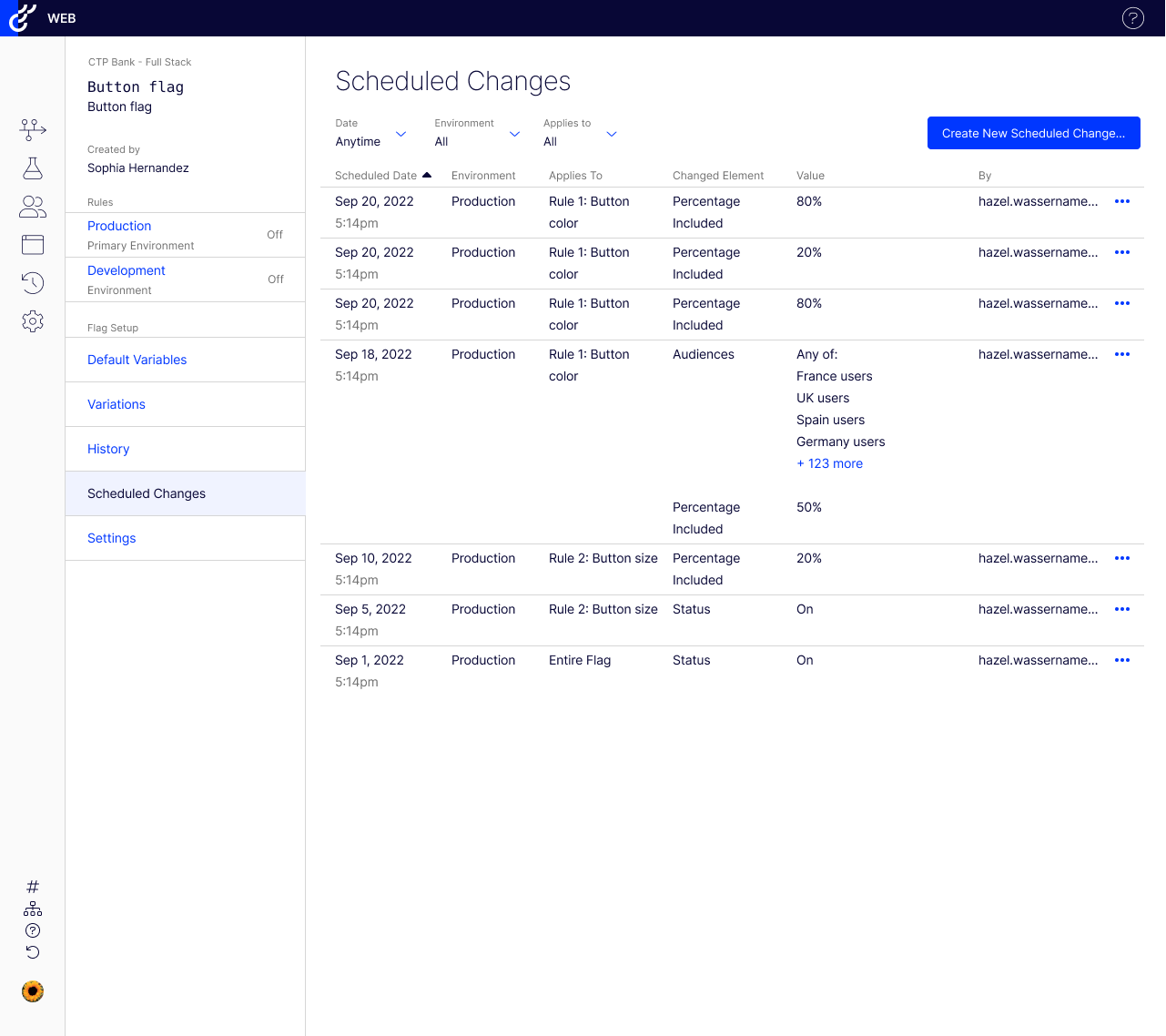
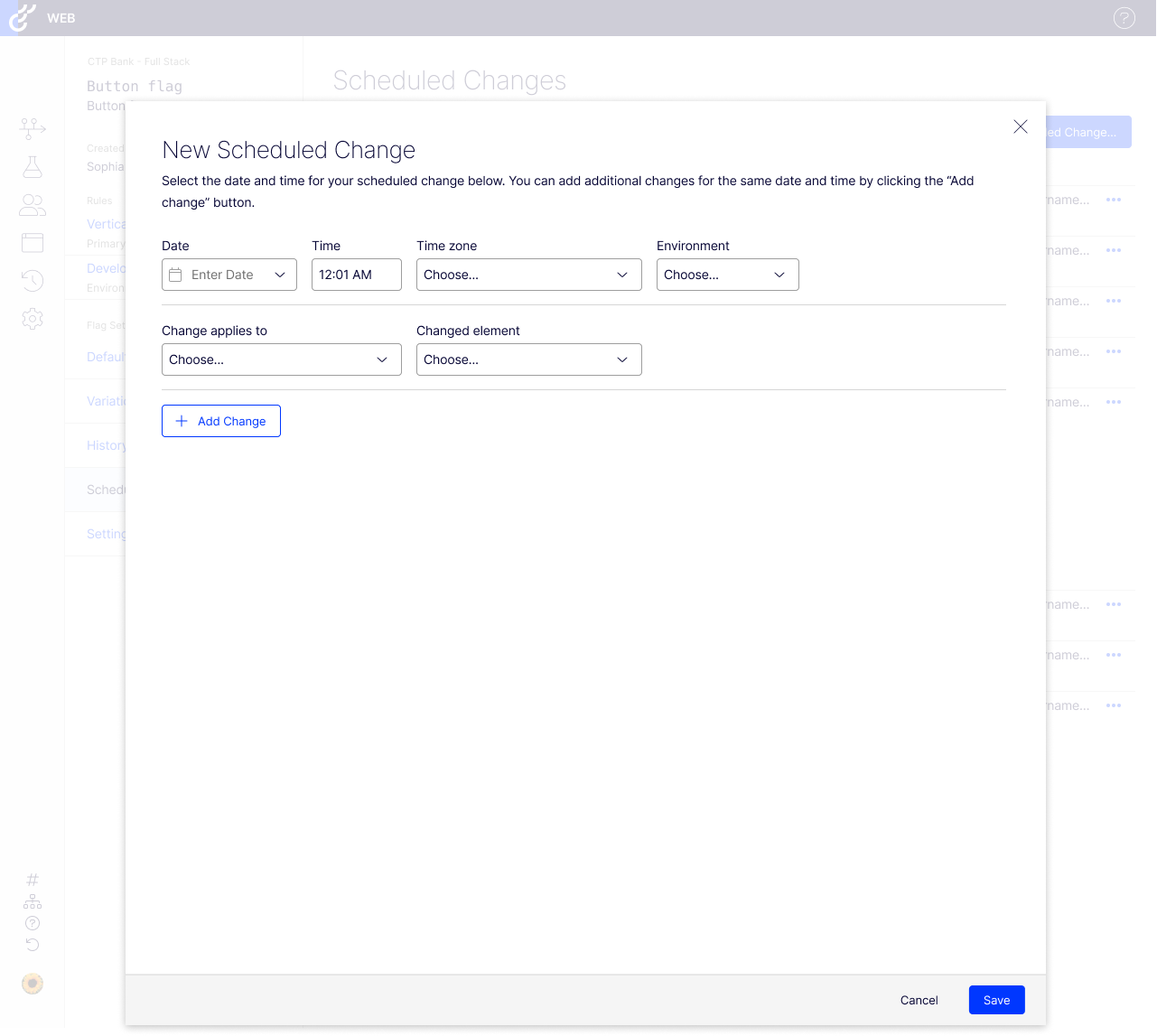
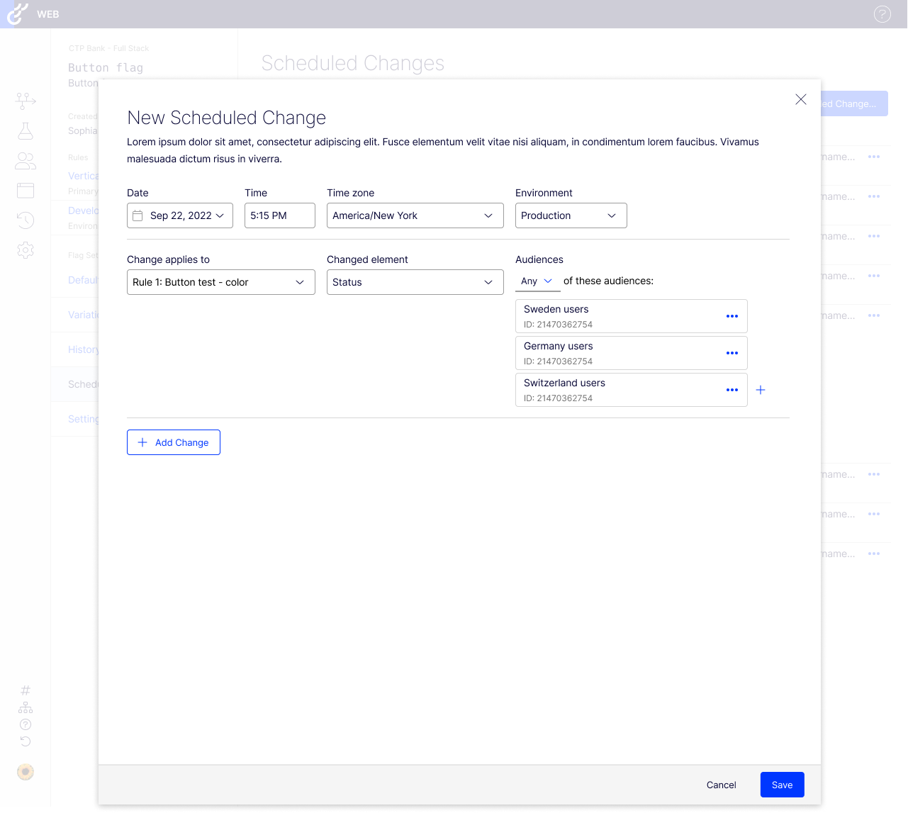
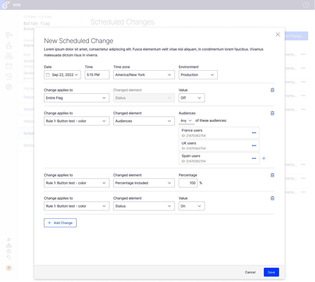
Below are a few sample screens from the final design showing how a user moves through the flow, starting at the newly created Schedule Changes list view page, then opening a modal to create a new change, then adding various changes before finally hitting Save.
Results
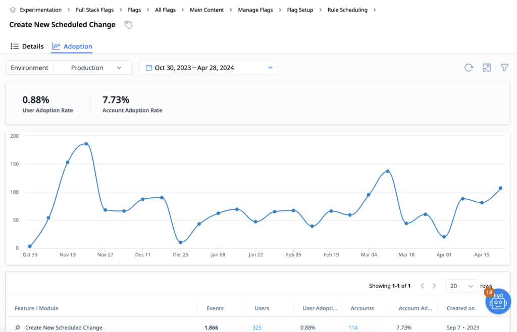
As you can see by the usage report below, we launched this feature in early November during which usage saw a spike (due to the announcement of the feature) then settled into a fairly consistent usage pattern where about 7.7% of accounts used this feature regularly. While that number doesn’t seem high, it is to be expected with a feature like this that will solve a big problem for a smaller audience. The fact that usage numbers have been consistent for the 9 months since it launched is a good indication that the feature continues to provide value to users beyond the initial launch spike.
Thanks for reading!
Bonus Problem:
Colliding Scheduled Changes
One of the more interesting challenges that we encountered early on in the design process was how we would handle two scheduled changes which contradict or interfere with each other. For instance:
- Jeremy creates a Rule to be shown to the “North Carolina (NC) users” audience and schedules the traffic to increase gradually from 10 – 100% between Sep and Nov.
- Then, in late-September, Griffin switches the audience from “NC users” to “Everyone” with immediate effect (not scheduled for the future).
- When November comes, will the rule be shown to 100% of “NC users” or 100% of “Everyone”?
This was one of the many topics we discussed in our user research sessions and to aid the discussion I made several timeline diagrams of hypothetical scheduling collisions. You can see one below.
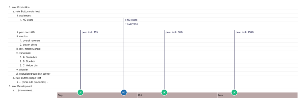
Diagrams like these are sometimes helpful in facilitating a discussion with users, devs, or other stakeholders about how a feature will work with complex scenarios and I use them frequently in projects that need them.